The arsouyes get a makeover
For some time now, the web has felt somewhat dull to us. Maybe we're getting bitter with age, or maybe the social mood lately doesn't lend itself to it. But in the end, it's hard to find that slightly flamboyant fun of the early cyber-years when browsing from blog to blog.
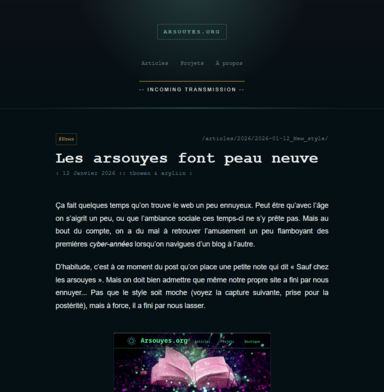
Usually, that's the point in the post where we'd add a little footnote reading, "Except at The Arsouyes". But we have to admit that even our own site ended up boring us... It's not that the look is ugly (see the following screenshot, saved for posterity), but over time, it just grew stale.
Let's not sound the alarm, though. It hits us regularly (cf. in 2017 and in 2023). We get an itch for something new and revamp the site's look to better match our state of mind. And since, every time, we find the new iteration qualitatively superior to the old one, we tell ourselves that eventually, we'll end up hitting the Holy Grail!"
Fun or readability?
The real trick to making a fun site is making sure it remains legible through it all... It's not like we're short on fun ideas. Behold the following screenshots...
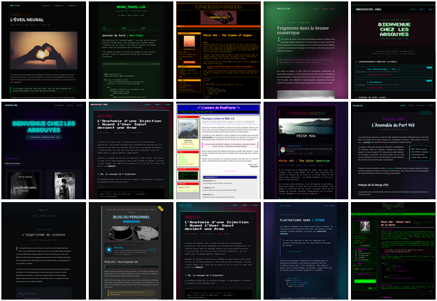
The problem is when these possibilities hit reality and things fall apart. The moment we replace the lorem ipsum and other placeholder illustrations with true content, we realize that scrolling banners, blinks, CRT effects, transparent backgrounds and animated rainbows don't exactly do wonders for legibility.
The style we came up with this time might not be the funnest out there, but at least it has the saving grace of not making your eyes bleed1.
We did some Spring Cleaning
Once we settled on the style and structure, we had to go through all the pages to review what needed adapting and took the opportunity to do some cleaning...
Footnotes. I love putting footnotes everywhere but the old style wasn't really cut out for it. For, as their name suggests, they sit near the footer of the page, making them a pain to use2. There are filters-based workarounds, to simulate marginal notes (cf. Arthur Perret) but we thought there should be a better way to solve the issue...
Fortunately, pandoc now features an argument to configure footnote placement (--reference-location): at the bottom of the page, at the end of the section, or right after the block that references them. We argued for the latter.
Less Quotes. Before, we used blockquotes (i.e. <blockquote>) for just about anything. Actual quotes, of course, but also passages we deemed important, and other supplementary bits... These inconsistencies have now been fixed.
Less Images. In a past life, we thought we needed illustrations on every article (even every section) and struggled to find images to do so. Aside from a few rare exceptions that actually added something, we axed all those illustrations.
Less news. Similarly, we kept a copy of our emails sent to the mailing list, categorized as news. Let's be honest, these posts were just listing links to new articles and to press mentions we appeared in. Since that info is already available, we deleted those posts and only kept the news that actually bring value.
And after?
This new style is supposed to better reflect our state of mind3. We're not entirely done yet and have a few tweaks in mind, but the foundation is there and we're just happy it's live.
We combed through everything to check, but a few typos might have slipped through here and there. If you spot any, let us know.